Heatmap visualizes individual values in a matrix and represents them through different color shades based on their intensity. Use it to analyze the differences across multiple variables, reveal patterns, and detect correlations between them.
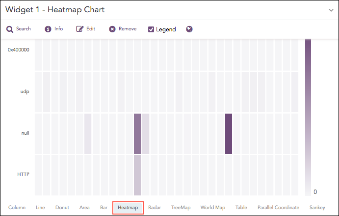
Count of logs grouped by action and protocol.
The following query gives the output shown above.
| chart count() by action, protocol
The Heatmap chart supports a single aggregation response types for representation of search results in the visualization. It is :
Response Type |
General Syntax |
|---|---|
| chart aggregation_parameter by grouping_parameter1, grouping_parameter2, ........, grouping_parametern
|
Example:
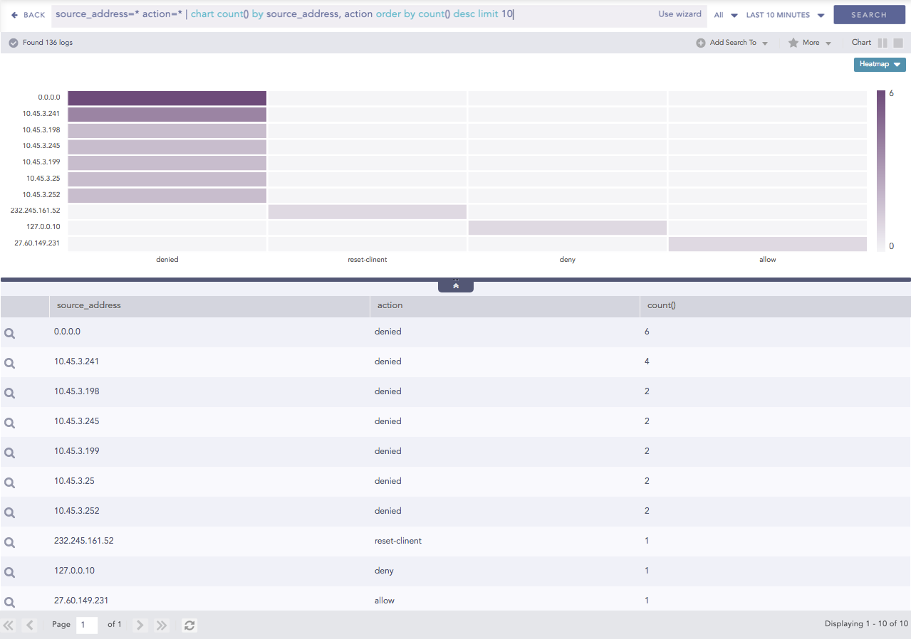
source_address=* action=* | chart count() by source_address, action order by count() desc limit 10
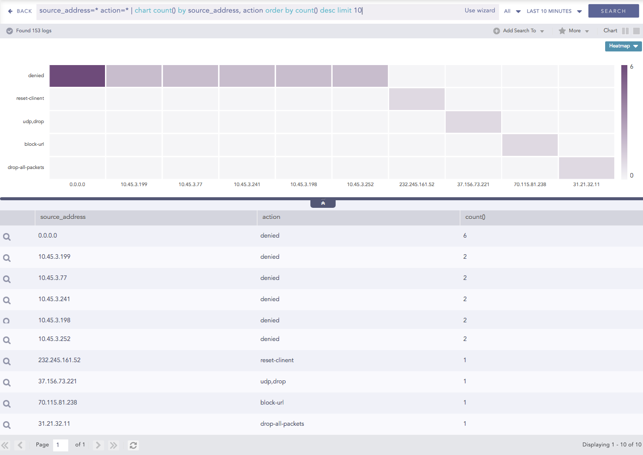
Heatmap for Single Aggregation with Grouping
You can refer to Single Aggregation with Grouping for more details.
Click the settings icon at the top-right corner of the heatmap chart to open a dialog box. The dialog box allows you to configure the rendering parameters of the Heatmap chart.
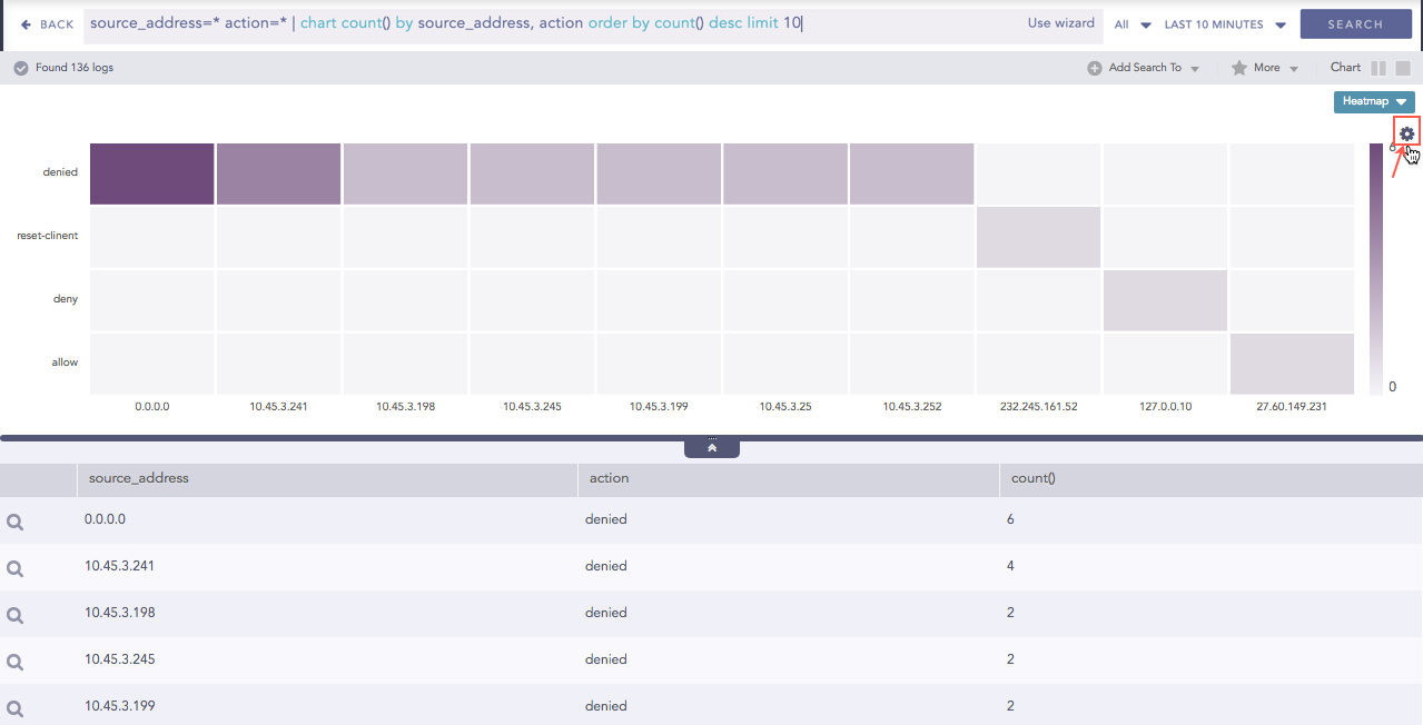
Rendering Parameters
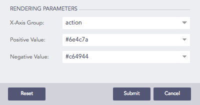
The Rendering Parameters such as X-axis Group, Positive Value, and Negative Value provide a custom settings option to view data in different formats.
By default, the first grouping parameter of the query is assigned to the X-axis of the Heatmap. For example, the grouping parameter source_name is assigned in the X-axis of the Heatmap for the query:
| chart count() by source_name, action
However, by selecting a value from the drop-down menu of the X-axis Group, you can choose the grouping parameter to be placed on the X-axis of the chart. For example,
| chart count() by source_name, action
The query above contains two grouping parameters: source_name and action. If you choose action for x-axis, source_name is shown on y-axis. The count() value is represented according to the transparency level of the chosen cell color.
Note
If a query contains three or more than three grouping parameters, and you choose to keep grouping_parameter_1 on the x-axis, then the combination of grouping_parameter_2, ………, grouping_parameter_n is shown on the y-axis.
Furthermore, you can assign custom colors to the Heatmap for both positive and negative values. LogPoint uses the selected color to represent the maximum value of the data obtained, and lesser values have the same color with linear transparency.
Heatmap with rendered values